

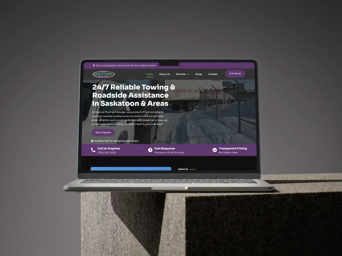
When Anytime Towing came to us, their old site had a beautiful hero photo, a paragraph about the company's history, and a phone number in the footer. On a phone, that number was four screens down. They were paying for Google Ads that sent people to a page that made them hunt.
Design for one moment
Every service business has a single moment where the customer decides. For a tow company it's the shoulder of Highway 11. For a plumber it's a flooding basement. The site's job is to make the next step obvious in under three seconds - not to tell a story.
So the first screen of the new site has exactly three things: the business name, the promise ("Saskatoon · 24/7 · 30 min average"), and a phone number rendered as a button that fills the width of a thumb.
"The site paid for itself in the first month. Calls come in every day from people who found us on Google."Dave Peterson, Owner - Anytime Towing
What "above the fold" means on a phone
On a 390px-wide screen you get roughly 600px of height before the browser chrome and thumb zone eat the rest. That's room for a headline, one line of proof, and one button. Anything else pushes the button below the decision point.
- Phone number as a tel: link styled as a full-width button, not text.
- One line of proof that answers "will they come?" - hours, area, response time.
- No carousel, no video autoplay, no chat widget covering the button.
What changed
Call volume from the site roughly tripled in the first month, and the cost per call from Google Ads fell because people stopped bouncing. The full numbers, the service-area map, and the local SEO work are in the Anytime Towing case study.
Apply it to your site this week
Open your site on your phone. Count how many swipes until you can call or book. If the answer isn't zero, that's the first thing to fix - before the logo, before the copy, before the SEO.
